“They laughed at my Amazon listing images, but when I showed them my sales numbers…”
You want to move more units, right? Higher conversion and higher sales numbers every month sounds great, doesn’t it? Well, it all starts with convincing customers to purchase your product (right now you’re saying, “of course”). The question is: how do you get customers to perceive your product as the best option? This blog is all about how to create effective listing images that sell your product.
Amazon has given customers more buying options than ever. For you, that means more competitors and the need to differentiate from them. You need to differentiate your product as the best option (or at the very least, a viable option), and most Amazon sellers are given the same listing layout: a product title, a handful of bullet points, and 7 positions for content. We know from many studies that 100% of ad viewers see the images, which makes your images the most important tool on your listing. Below is Ogilvy’s hierarchy of attention. You’ll notice that 100% of people see the picture, which is followed by 80% of people reading the headline:
Okay, so images are important. Now, how do you create better images to make more sales? Below is my 7-tip prescription for creating Amazon listing images that work.
1. Create a main image that stands out
What good is a perfect listing if no one ever sees it? When shoppers search on Amazon, they are given a grid of images, which presents an opportunity to make a choice and make a click. What will they choose? Well, let’s look at a very basic product like white paper plates that are hard to differentiate. Here is an Amazon search for “white paper plates”:
Excluding the “Amazon’s Choice” banner, there are 3 clearly distinguished products that show the quantity of plates included. The #1 rated product on this search by a long shot is the bottom left “125-pack,” which has nearly 13,000 reviews compared to the next best at 3,099 reviews.
While it’s important to distinguish your main image, it’s important to know that Amazon restricts what is permitted. Among Amazon’s rules for the main image are the following:
You must show your product over a white background
You are only allowed to show what is being sold
Additional text that is not on your packaging is not allowed
A hand holding your product is not allowed
2. Always use 7 images
Okay, so you make a click-bait-y main image, and someone lands on your listing… now what? Add an image to every visible slot of content that Amazon allows you to add, which is 7 visible images. The reason this is so important is because:
Images get attention
Images show your customer what they are buying
Amazon prioritizes images on mobile
Customers can’t see and feel a product like they can in a store, which causes uncertainty and increases the friction in making a purchase. As a seller, you can limit this uncertainty by providing as much visual information as possible in the 7 image slots provided.
3. Use high quality photography
You always want to give your product an image of quality. You convey high quality by using high quality images and photography. It doesn’t matter if you sell Vans or Versace, low quality images will hurt your sales. Look at this Amazon listing by Louis Vuitton trying to sell a bag for $1,560, and tell me if you would make the purchase:
Okay, I made that in Photoshop, but you get the point. Photography supports your product’s brand image, so create an image of quality.
4. Use images to advertise your product’s features and benefits
You probably use Amazon’s bullet points to describe your product’s features and benefits. Use that product copy on your images as well. As we saw above, you are much more likely to get shoppers looking at images, so adding the product copy to the images is going to help sell your product. Using text on images is also very important when considering the mobile Amazon experience which I will talk about next. Below are sample photos from the new Beats Studio Buds listing that does this well. Beats highlights features and benefits that matter to the shopper and makes the text big enough to be read on either desktop or mobile:
5. Optimize your images for both desktop and mobile
In 2020, 49.2% of all e-commerce sales were made from mobile phones according to statista.com, and this number is expected to go up every year for the next few years. More shoppers are using mobile devices to make purchases, and the data shows that conversion is higher when shopping on mobile. Bottom line: optimizing your listing for the Amazon mobile app and mobile browser is important.
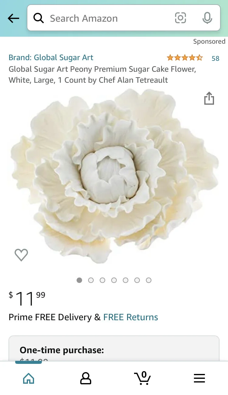
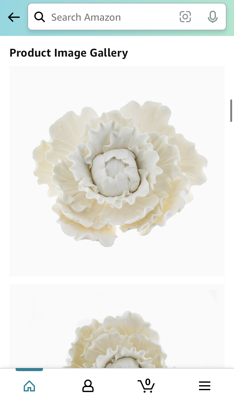
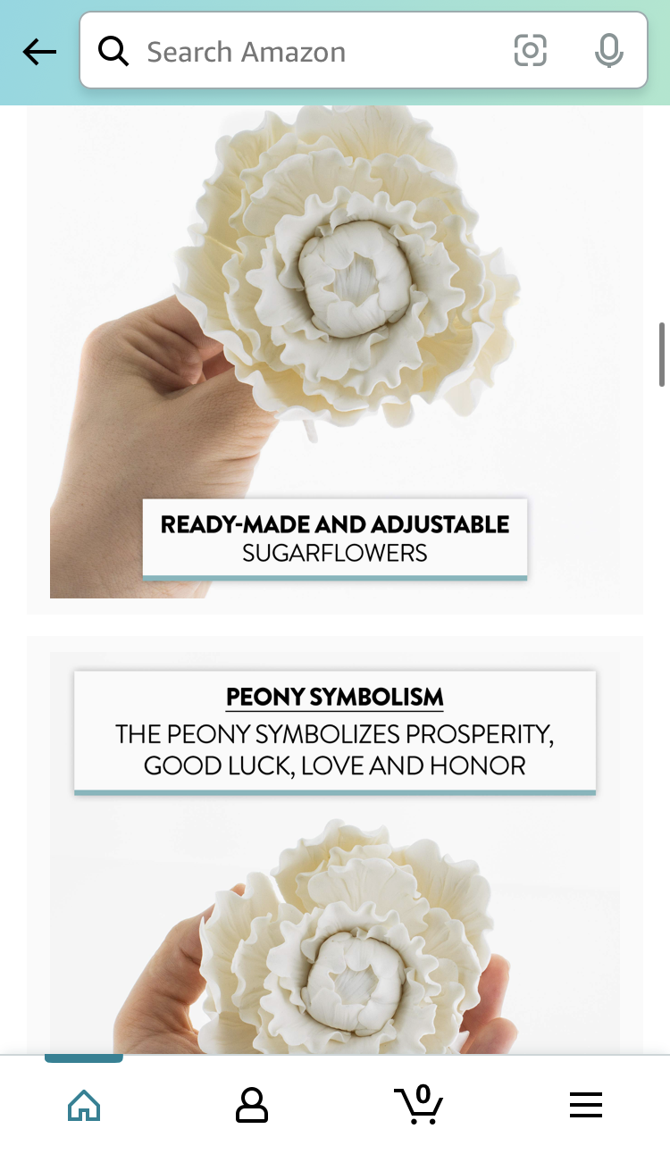
The images on your listing are especially important when it comes to your mobile listing because Amazon heavily prioritizes and favors showing the images. Amazon has made it harder to find the bullet points, while displaying your listing images twice on your mobile app listing: first as a swipe-through carousel and second as a “product image gallery” where all your photos appear in a stack right below the listing. So when designing your images, make sure the text you add to highlight your product’s features and benefits is big enough to be read on mobile. Text that is unreadable can lower the perceived quality of your product and actually reduce sales.
Here is a screenshot of the mobile app showing that the bullet points are mostly hidden and Amazon requires you to expand the window:
Below are three more screenshots from the mobile app showing the 2 different areas Amazon displays photos on the same listing page (the main carousel and the product image gallery). Notice on the third screenshot that this listing uses text to highlight features and the text is legible on mobile:
6. Show the product in use
Show the customer the different ways they can use the product to convey its versatility. You can buy the new Beats Studio Buds to listen to music, but you can also use the noise cancellation feature to get better sleep on an airplane or be more productive while working at a coffee shop. You can buy a panini press to make paninis, but you can also make wraps, quesadillas, and more. Show the customer the different ways in which they can use your product. Below is a great example of this by Truff who sells truffle oil hot sauce. Such a niche product requires some education on how to use it:
This waterproof iPhone case uses one of their listing images to show all the places you could use it:
7. Convey important information about your product
Depending on what kind of product you are selling, there is going to be some important information your customers are going to look for. This could be nutrition facts for dietary restrictions, product dimensions, product color, what’s in the box, and more. Depending on what you are selling, show that information using your listing images. Below are a few examples of this:
Dimensions for a bed frame:
Dietary and nutritional information for a KIND bar:
Airline approved at-home nasal PCR Covid-19 test:
What’s in the box for the new Beats Studio Buds:
Creating images that produce more sales
Your listing determines your product’s perception of quality, whether that be good or bad. To create more sales using your listing images you need to communicate what the customer is buying, how the customer can use the product, and that this product is high quality. Use all 7 images and make sure they are optimized for the mobile app and mobile browser.


